
10 Mistakes That Can Undermine a Sign's Effectiveness
In the physical marketplace, your visual branding often serves as the initial handshake between your business and prospective clients. High-impact displays act as continuous visual anchors that guide foot traffic, establish brand recognition, and communicate your core value proposition before a single word is spoken. However, crafting visual displays that consistently grab attention and convert casual onlookers into loyal customers requires careful planning, strategic design choices, and ongoing care. Even small oversights during the initial planning or installation stages can significantly weaken the clarity and impact of your overall presentation.
When visual displays fail to perform, businesses often lose out on valuable foot traffic and local visibility without even realizing it. Identifying and correcting frequent design, structural, and placement mistakes allows you to maximize your outreach and protect your marketing investment. By taking a thoughtful approach to visual communication, you can ensure that your brand presents a clean, powerful, and professional presence in any physical space. Below are ten critical mistakes that can undermine how effectively your business communicates with the public, along with actionable ways to ensure your messaging achieves its full potential.
1. Overcomplicating the Overall Layout
A crowded layout is one of the quickest ways to reduce the impact of your signs. When a display is crammed with too much text, multiple competing logos, or high-contrast graphics, the primary message quickly gets lost in the visual noise. Passing pedestrians and drivers have only a few brief seconds to take in your message, so keeping visual clutter to an absolute minimum is essential for success. Clear, simple visual elements allow the core message to stand out effortlessly across busy streets and crowded environments. When you simplify your layout, you eliminate unnecessary distractions and give your primary offering room to shine. By keeping the design balanced and focused, you ensure that viewers quickly grasp what you offer without feeling overwhelmed or confused by competing graphic elements.
2. Neglecting Readable Font Choices
Typography plays a massive role in how effectively signs communicate with potential customers on a daily basis. Choosing overly decorative, ultra-thin, or intricate script fonts might look visually interesting on a computer screen during the design process, but they are often nearly impossible to read from a distance or while moving. Selecting clean, high-visibility typefaces ensures your wording remains crisp and legible under various lighting conditions and viewing angles. Consistent letter spacing, appropriate font sizing, and distinct character shapes allow your message to translate clearly to anyone passing by, maximizing the visual impact of your physical investment. Prioritizing readability over elaborate flourishes ensures your messaging always lands clearly.
3. Choosing Poor Color Contrast
Color choice goes far beyond simple brand aesthetics; it directly dictates legibility and visual reach. Low contrast between the text and background, such as dark lettering on a dark background or light pastel text on white, makes signs nearly impossible to read from any significant distance. High-contrast combinations ensure that messaging pops clearly, even in dim twilight, heavy fog, or harsh direct sunlight. Using contrasting shades strategically draws the eye directly to critical contact details, promotional offers, and corporate names. Proper contrast testing during the early design phase guarantees that your display remains visible, vibrant, and impactful throughout every hour of the day.
4. Placing Displays in Obstructed Locations
Even a flawlessly designed concept fails completely if people cannot actually see it from the street. Installing signs behind seasonal tree branches, low-hanging light poles, parked vehicles, or structural overhangs severely limits their visual range and effectiveness. Before finalizing an installation spot, it is vital to thoroughly evaluate line-of-sight angles from surrounding roads, intersections, and pedestrian walkways. Accounting for seasonal foliage changes, future construction projects, and surrounding architectural features helps guarantee that your messaging stays fully visible year-round without unexpected physical barriers blocking the view of potential clients.
5. Ignoring Proper Viewing Heights
Mounting displays too high or too low forces viewers to strain their necks or look away from their natural path of vision. Eye-level placement works remarkably well for sidewalk foot traffic and window shoppers, whereas roadside installations require elevated positions that align directly with driver sightlines. According to IBISWorld, the billboard and sign manufacturing industry in the United States is valued at $16.4 billion in 2026. This massive commercial investment underscores how critical proper positioning and strategic placement are for commercial success. Matching installation height to human perspective ensures your message captures immediate attention without forcing viewers to search for it.
6. Failing to Match Scale with Distance
A common error is designing messaging without fully considering how far away the target audience will actually be when viewing it. Small lettering that looks perfectly fine on a desk proof becomes completely unreadable from fifty feet away on a busy thoroughfare. Calculating letter height based on viewing distance ensures your messaging remains fully legible whether viewed by slow pedestrians or fast-moving highway traffic. Proper scaling allows your display to communicate effectively across any physical space, maintaining clarity regardless of viewing distance.
7. Presenting Vague or Confusing Messaging
Ambiguity creates immediate hesitation, and hesitation causes potential customers to keep moving past your store. If your message does not clearly state what services you offer or what immediate action the viewer should take, it loses its core purpose. Concise, direct phrasing combined with straightforward contact details or clear directional arrows helps convert casual viewers into active leads. Striking the right balance between concise wording and clear intent ensures your audience fully understands your business offer in a single glance.
8. Disregarding Lighting Conditions
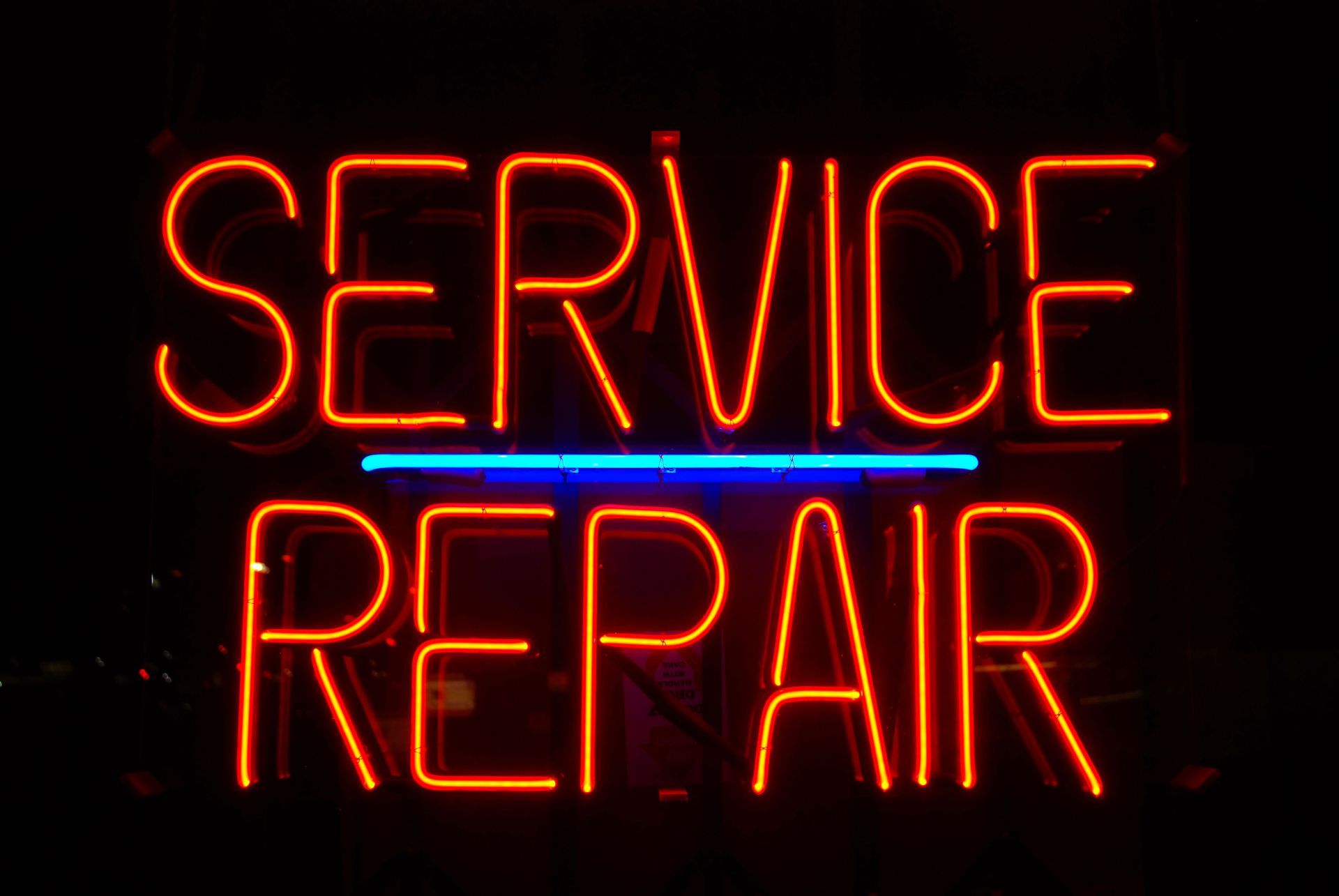
A display that looks vibrant during the daytime can become entirely invisible once the sun goes down if illumination is overlooked. Failing to integrate proper illumination limits your outreach strictly to daylight hours, effectively cutting your potential audience in half every single night. Incorporating integrated backlighting, internal LED modules, or strategic external spotlights keeps your messaging active and clear around the clock. Constant visibility maintains continuous brand awareness, keeping your business top of mind for late-night commuters and weekend visitors alike.
9. Overlooking Material Quality and Weathering
Outdoor elements like torrential rain, high winds, freezing temperatures, and intense UV sunlight quickly degrade low-grade materials. Faded colors, cracked acrylic panels, rusted hardware, and peeling vinyl reflect poorly on your business image, making your entire operation look not kept up with and unprofessional. Selecting durable, marine-grade, or weather-rated materials designed to withstand harsh environmental conditions preserves the fresh, professional look of your exterior branding over many years. Investing in high-quality weatherproofing protects both your visual brand identity and your long-term marketing budget.
10. Skipping Routine Maintenance and Repairs
Even high-quality physical installations suffer over time from dirt accumulation, burnt-out lighting elements, or general wear and tear. Allowing damaged, dirty, or unlit displays to linger sends a negative message to potential clients about your overall attention to detail and business standards. Establishing a regular routine for gentle cleaning, structural checks, and prompt electrical repairs preserves the visual appeal and functional performance of your exterior displays. Keeping your messaging fresh, clean, and fully operational ensures your brand continuously projects professionalism, competence, and pride.
Avoiding these ten common pitfalls is the absolute key to creating effective exterior and interior branding that drives real, measurable business results. By focusing on legible fonts, strategic physical placement, high color contrast, precise scaling, and continuous routine maintenance, you create exterior messaging that consistently attracts, informs, and engages your target audience day after day. Partnering with experienced visual communications professionals ensures your overall vision is executed flawlessly from the initial design concept through final structural installation. Ready to elevate your business presence with high-impact visual solutions that get noticed? Contact Sign Design Inc today to discover how custom, high-quality
signs can transform your overall brand visibility and help you attract more customers every day.



Share On: